Brand Assets
Master Logo Configurations

Primary — Block
This primary logo should be used on most applications. The minimum width for this version is 1.5in.

Secondary — Horizontal
The horizontal arrangement of the logo should be used when the primary version is not legible, for example when the logo is placed in a small size.
Approved Logo Colors

✅ Use white when placed on a colored background

✅ Use red on white or other light background

✅ Use black when printing grayscale

✅ Use white when placed over top of photo
Primary Brand Colors
The color palette is deliberately limited to ensure consistent and recognizable communication materials.
Color Values (Digital)
RGB (or Hex) refers to the way color is created on digital screens. They’re used for digital ads, websites, video, apps, projection, or any other screen-based media.
Color Values (Print)
There are two main color systems used in printing: CMYK and Pantone (PMS). There will always be slight differences in color when working in print, particularly when compared with screen colors: this is unavoidable when considering the range of printing methods, pigments, and stock material available.

Red
HEX: E50B12
RGB: 229 / 11 /18
CMYK: 4 / 100 / 100 / 0
PMS: 2035 U

Black
HEX: 101012
RGB: 16 / 16 / 18
CMYK: 74 / 68 / 64 / 82

Light
HEX: F5F4ED
RGB: 245 / 244 / 237
CMYK: 3 / 2 / 6 / 0
PMS: Cool Gray 1 U

White
HEX: FFFFFF
RGB: 255 / 255 / 255
CMYK: 0 / 0 / 0 / 0
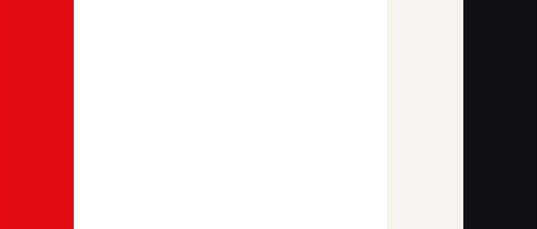
Primary Color Ratio
While color plays a large role in the overall design system, it is best used somewhat sparingly: a little bit of the red goes a long way. Don’t be afriad of using negative space. Our light color is only meant as a background color and should never be used for text.
Secondary Brand Colors
The secondary colors have a supporting role within our brand. They should be used sparingly and are never meant to replace the primary colors.
Use cases:
Charts / graphics, Illustration, Social media
Do not use these colors for text.
Text should only ever be set in black, red or white.

Wine
HEX 5c1a2e
RGB 92 / 26 / 46
CMYK 41 / 91 / 60 / 52

Teal
HEX 00857d
RGB 0 / 133 /125
CMYK 85 / 28 / 54 / 7

Marigold
HEX f09914
RGB 240 / 153 / 20
CMYK 3 / 45 / 100 / 0
Accessible color combinations
All examples shown meet WCAG contrast standards. We only use black or white for text.






Typography
Our typefaces are Open Source fonts available through Google Fonts.

Primary Typeface
Headlines, subheads, and other key points of messaging should be set using Readex Pro.

Secondary Typeface
Body copy, captions, and titles should be set using Roboto Regular

Tetiary Typeface (limited use)
Meta values, dates, data and camptions may be set using Roboto Mono.
